Content Builder Guide:
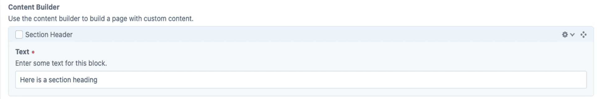
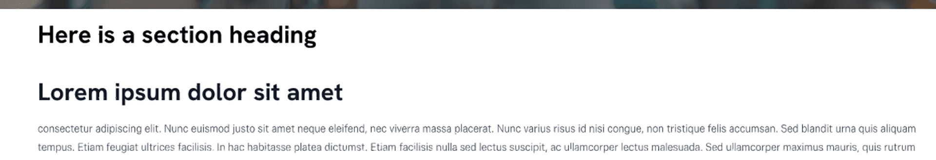
Section Header
To use the Section Header function, add the block, enter your heading text, and adjust styling if needed. It should appear as a clear, non-clickable heading that separates content sections for better readability.
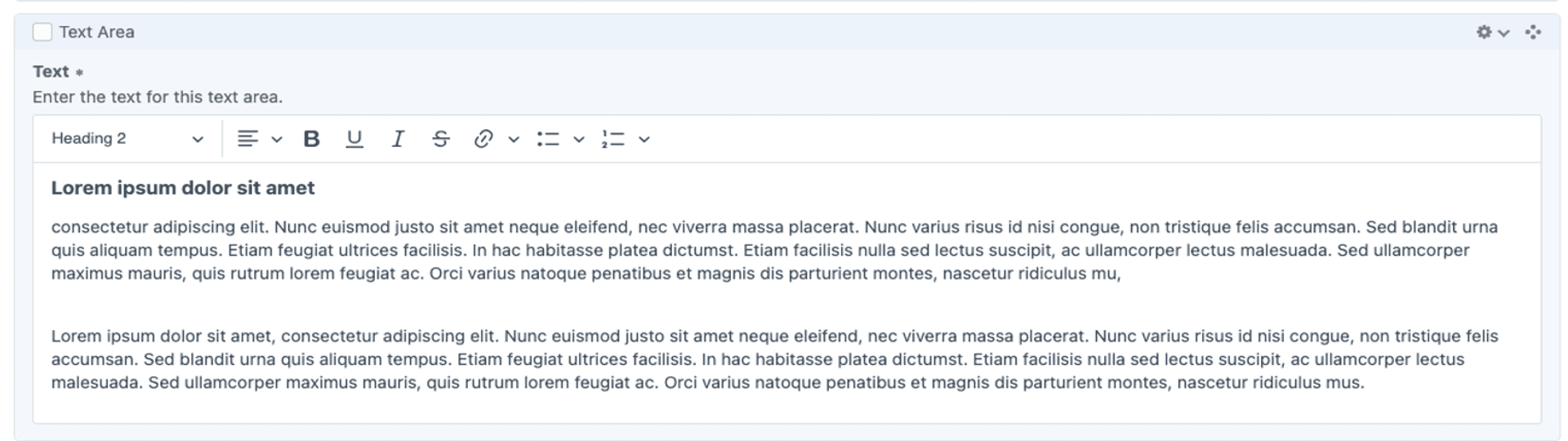
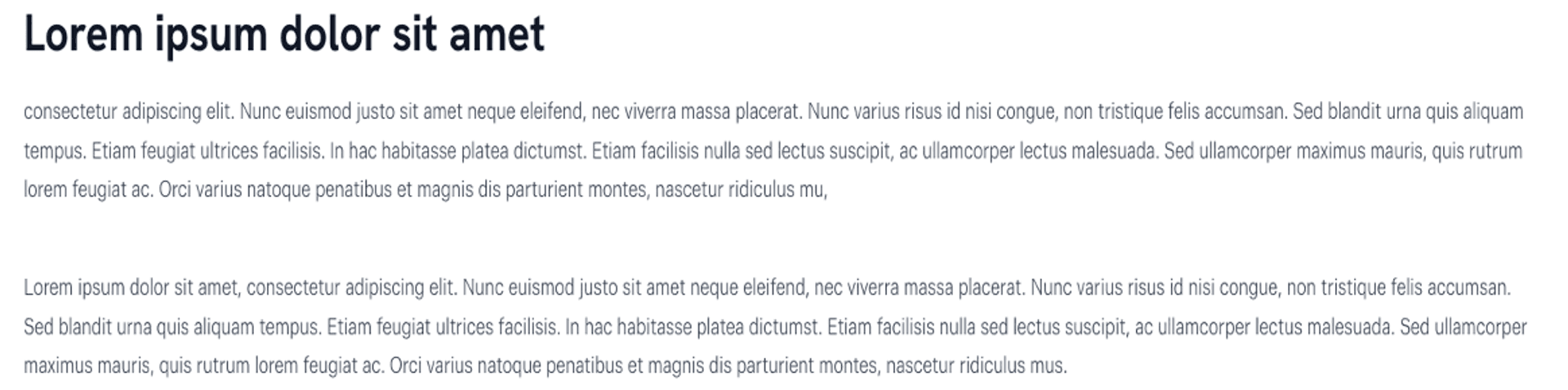
Text Area
To use the Text Area function, add the block, enter your content, and format it as needed with styling options. It should function as a flexible text field for adding and structuring written content within a page.
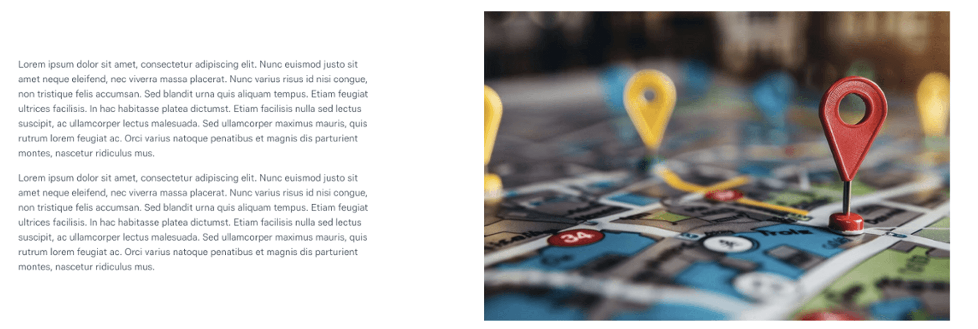
Text and Image block
To use the Text and Image Block, add the block, enter your text, and upload an image. Adjust the layout, alignment, and styling as needed. It should function as a combined content element, displaying text alongside an image to enhance readability and visual appeal.

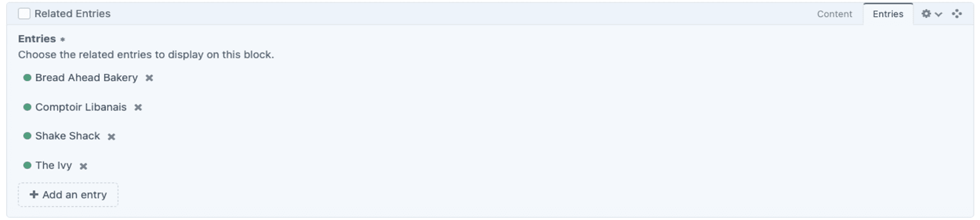
Related Entries
To use the Related Entries function, add the block and select relevant entries from the available list. Configure display options as needed. It should function as a dynamic link between related content, helping users navigate and discover relevant information.
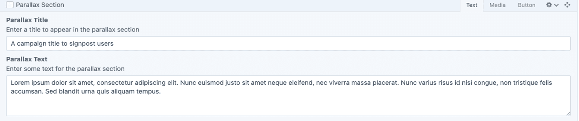
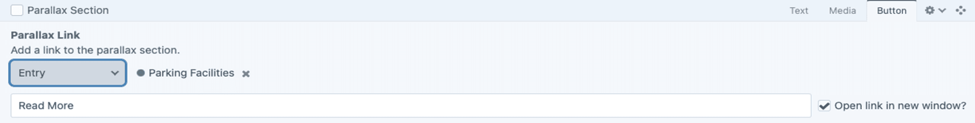
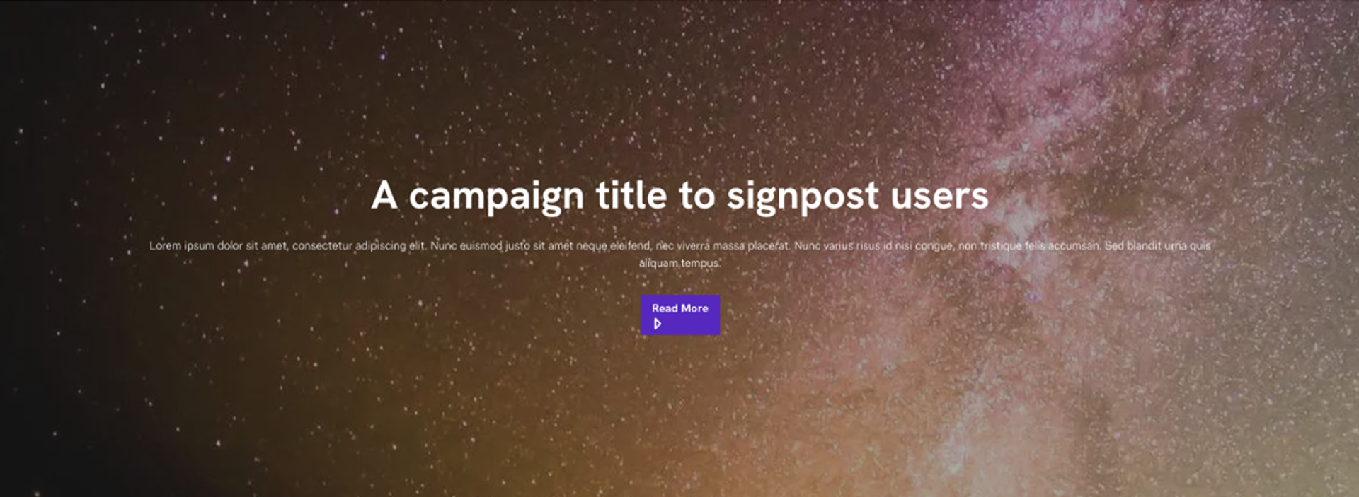
Parallax
To use the Parallax function, add the block, upload a background image, and adjust the speed and styling settings. It should function as a scrolling effect where the background moves at a different speed than the foreground, creating a dynamic and immersive visual experience.
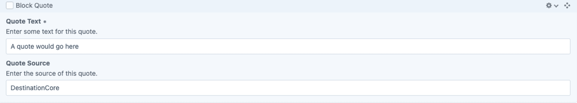
Block Quote
To use the Block Quote function, add the block, enter the quoted text, and optionally include the author's name/source. It should function as a visually distinct element that highlights important quotes within the content.

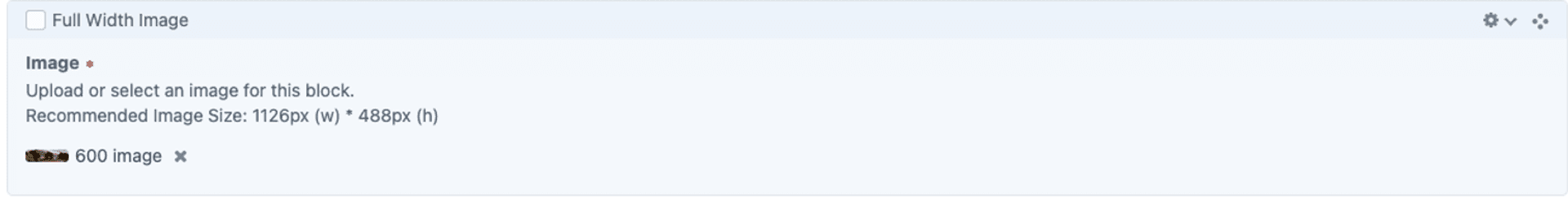
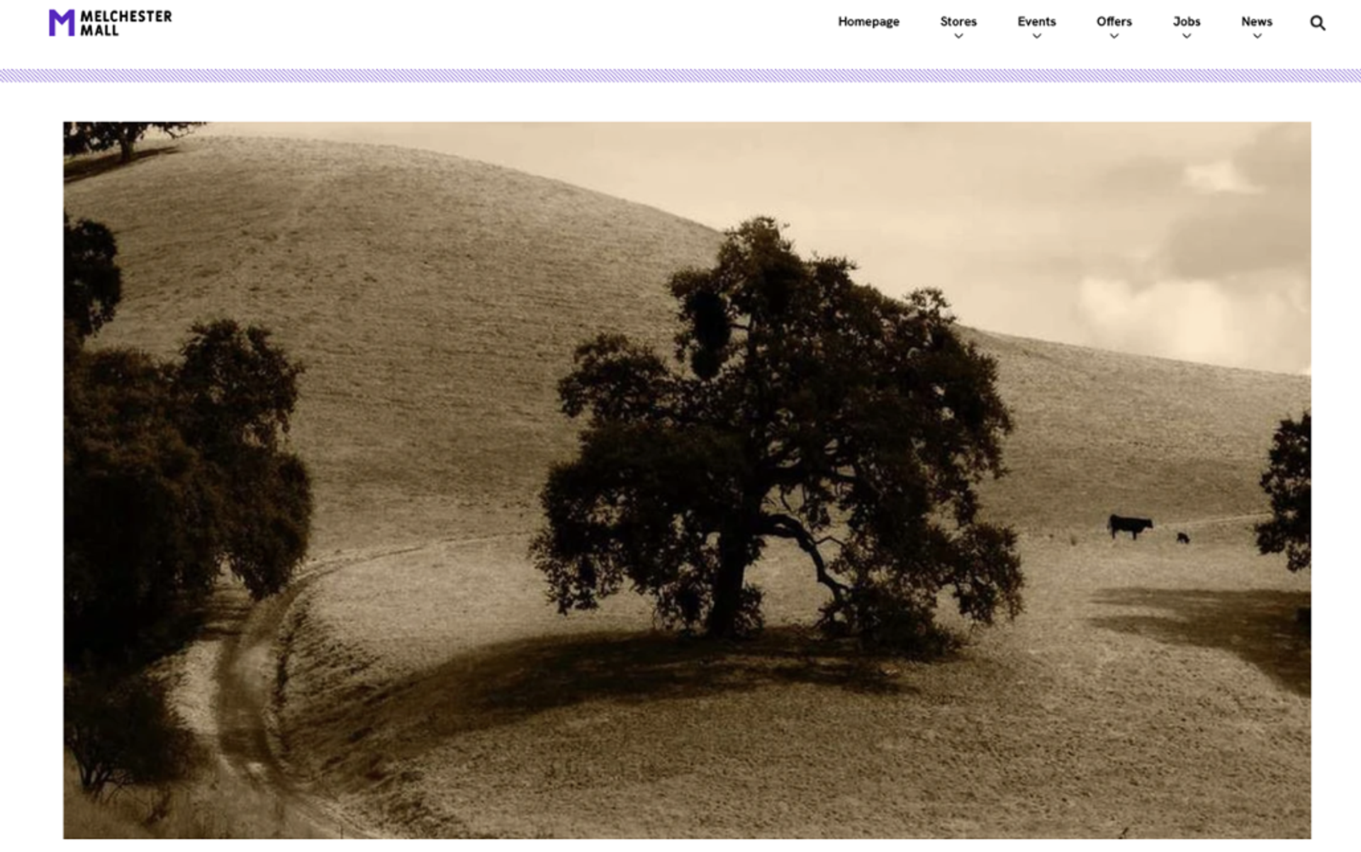
Full width image
To use the Full-Width Image function, add the block and upload your image. Ensure the image is high resolution and properly optimised. It should function as a visually impactful element that spans the entire width of the page, enhancing the design and emphasising key visuals.
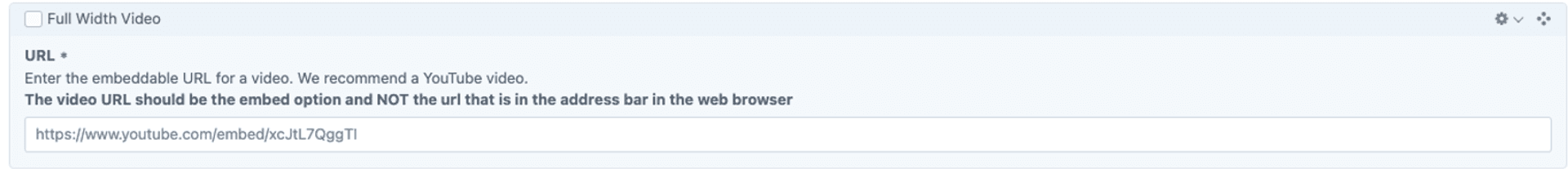
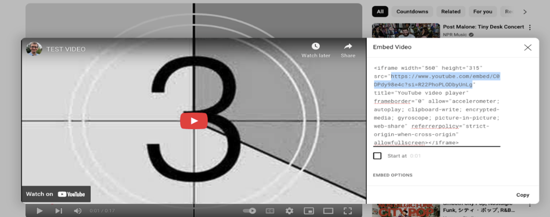
Full Width Video
To use the Full-Width Video function, add the block and upload a video or embed a link. Adjust playback settings if available. It should function as a dynamic, full-width media element that enhances engagement and visual impact on the page.
Card Section
To use the Card Section function, add the block and create individual cards by entering text, images, or links. Adjust the layout and styling as needed. It should function as a structured content section that visually organises information into distinct, easy-to-scan cards.
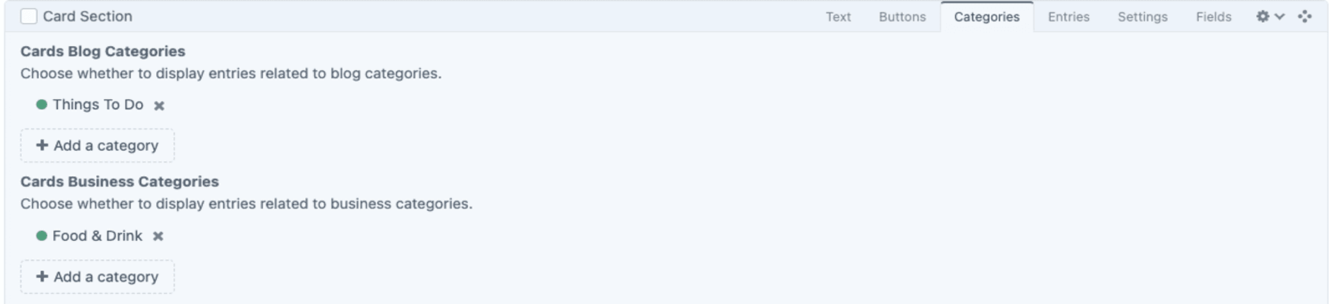
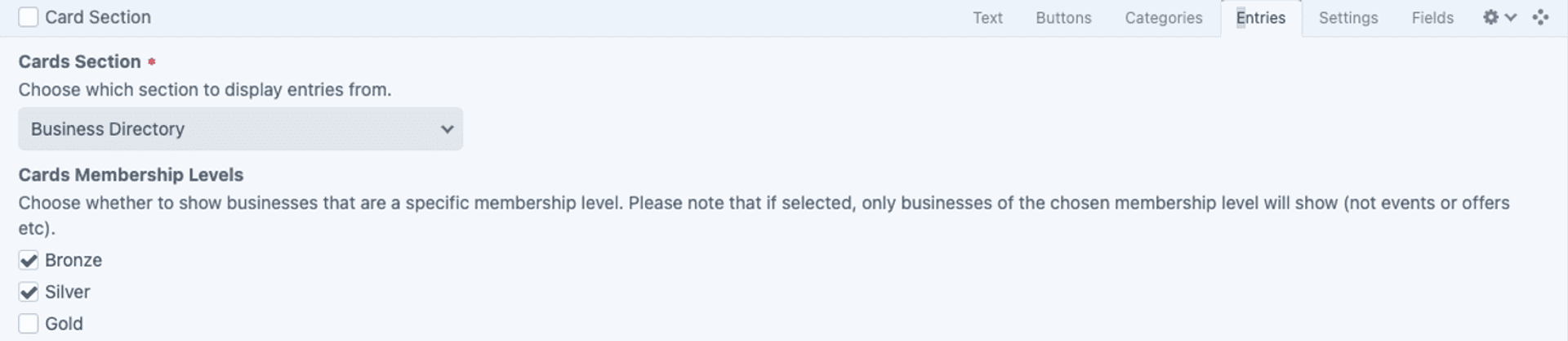
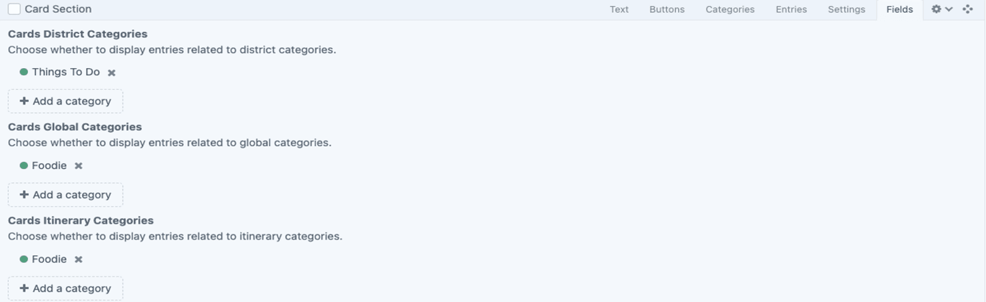
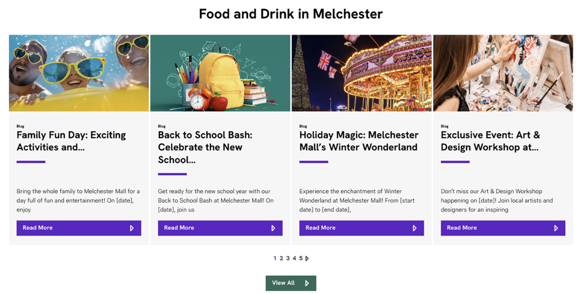
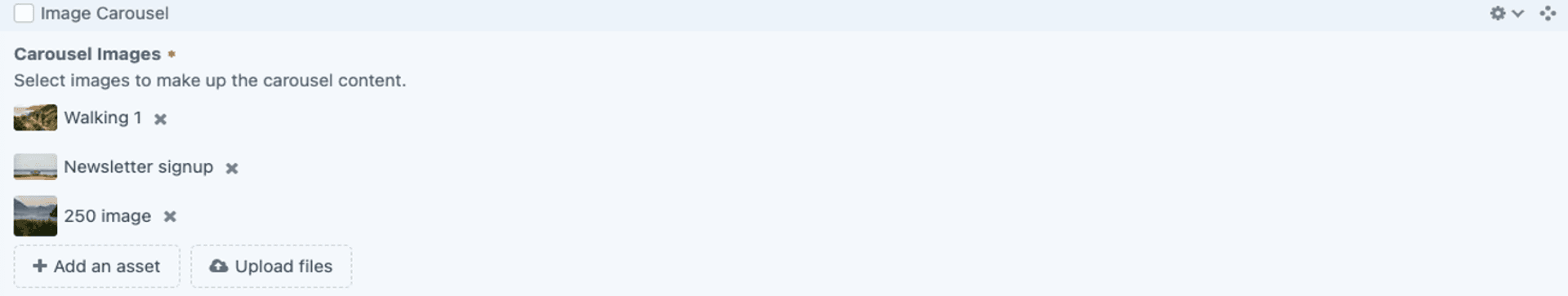
Image Carousel
To use the Image Carousel function, add the block and upload multiple images. Configure slide settings such as transition speed, autoplay, and navigation controls. It should function as an interactive slideshow, allowing users to browse through multiple images.

Video Carousel
To use the Video Carousel function, add the block and upload multiple videos or embed links. Adjust settings like autoplay, transition speed, and navigation controls. It should function as an interactive slider, allowing users to browse and play multiple videos.
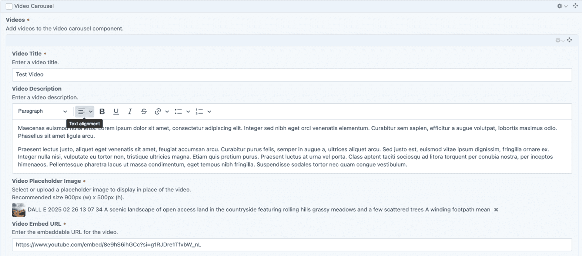
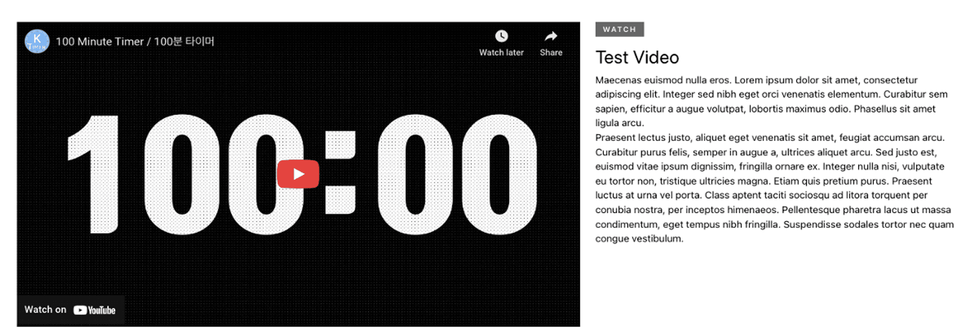
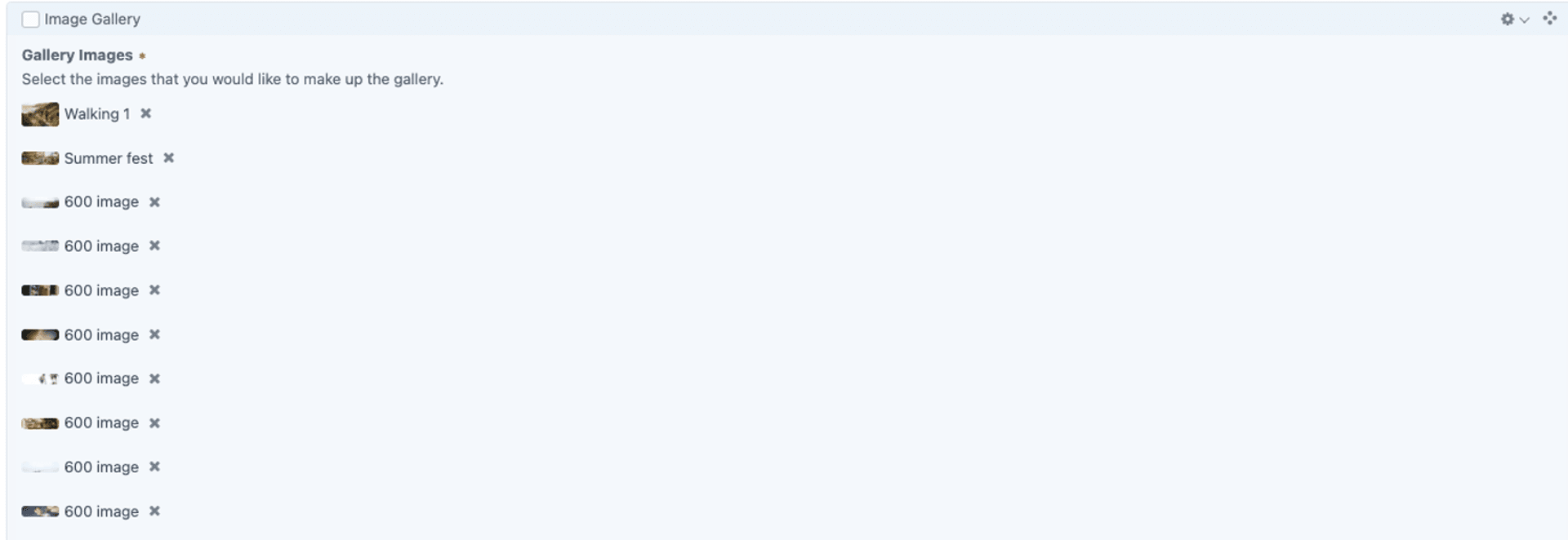
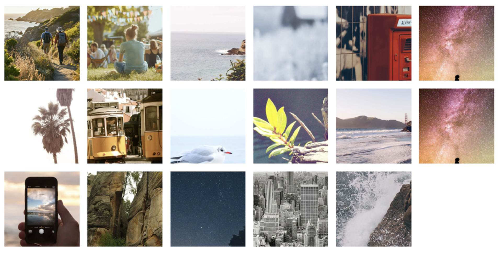
Image Gallery
To use the Image Gallery function, add the block and upload multiple images. Arrange them in the order you like and adjust display settings as needed. It should function as a visually engaging collection of images, allowing users to view multiple pictures in an organised format.
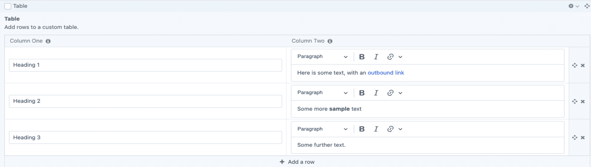
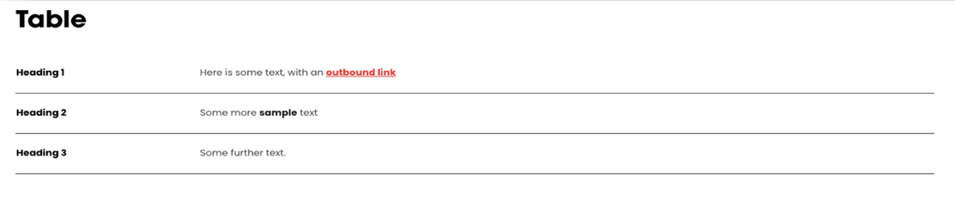
Table
To use the Table function, add the block and input data into rows and columns. Customise the layout, styling, and formatting as needed. It should function as a structured way to present information clearly, making data easy to read and compare.
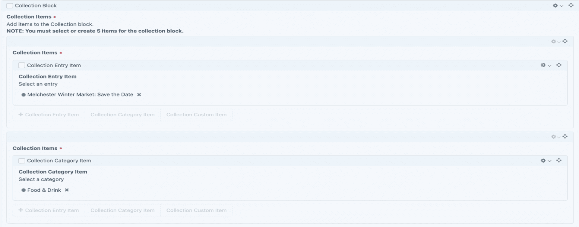
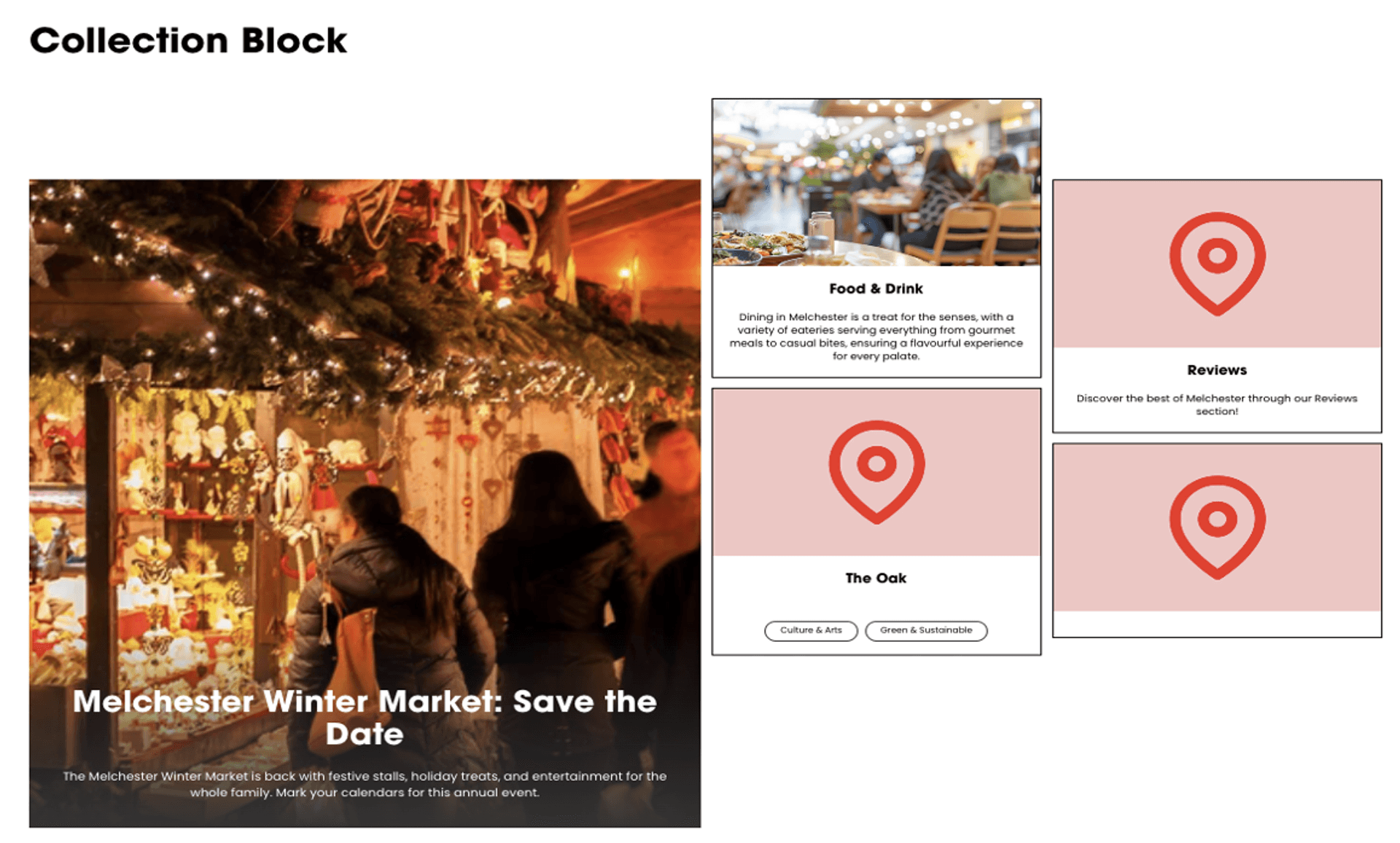
Collection Block
To use the Collection Block function, add the block and select or create multiple related items, such as articles, products, or images. Customise the layout and display settings. It should function as a dynamic grouping of content, allowing users to browse related items in an organised way.
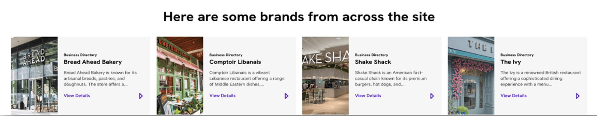
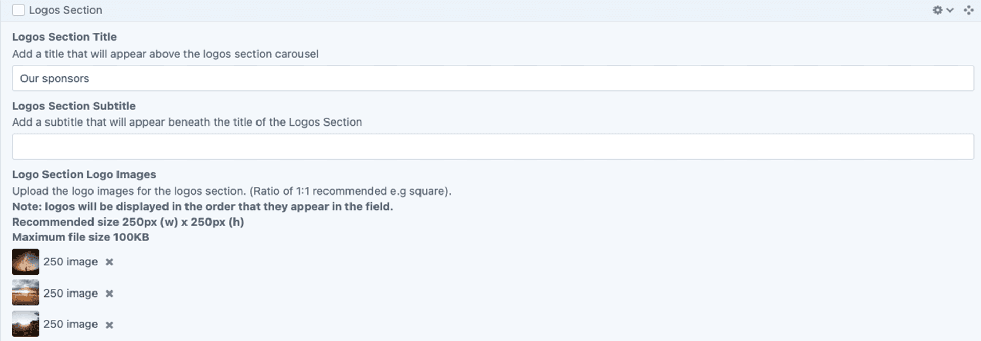
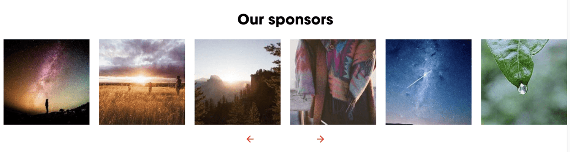
Logos
To use the Logos function, add the block and upload logo images. Arrange them in a grid or carousel and adjust sizing and spacing as needed. It should function as a visually organised display of logos, often used to showcase partners, sponsors, or clients.
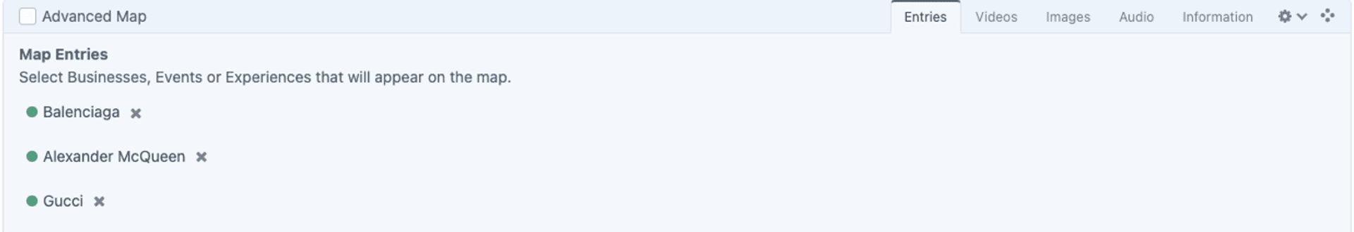
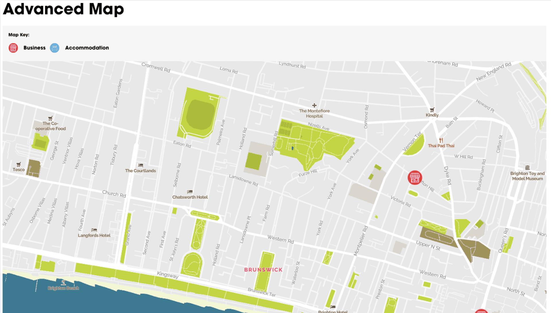
Advanced Map
To use the Advanced Map function, add the block and enter a location or embed a map link. Customise settings such as zoom level, map type, and markers. It should function as an interactive map, providing users with clear location information.
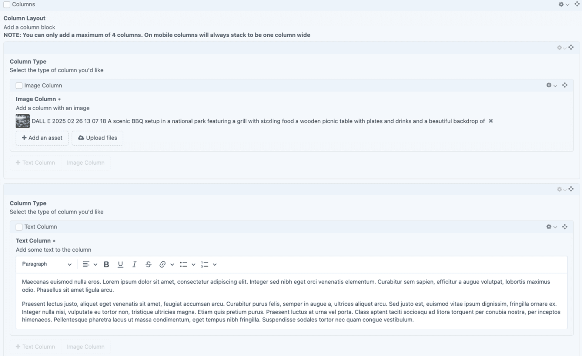
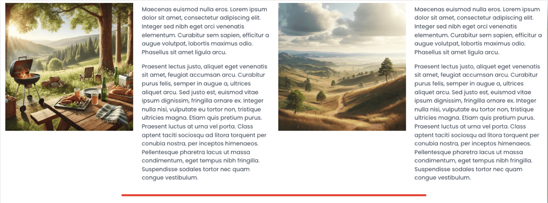
Columns
To use the Columns function, add the block and choose the number of columns needed. Insert text, images, or other content into each column and adjust styling as required. It should function as a structured layout tool, organising content into multiple vertical sections for better readability and design flexibility.
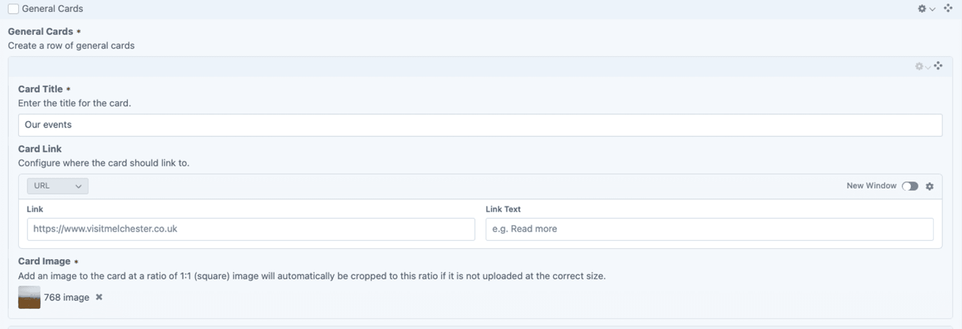
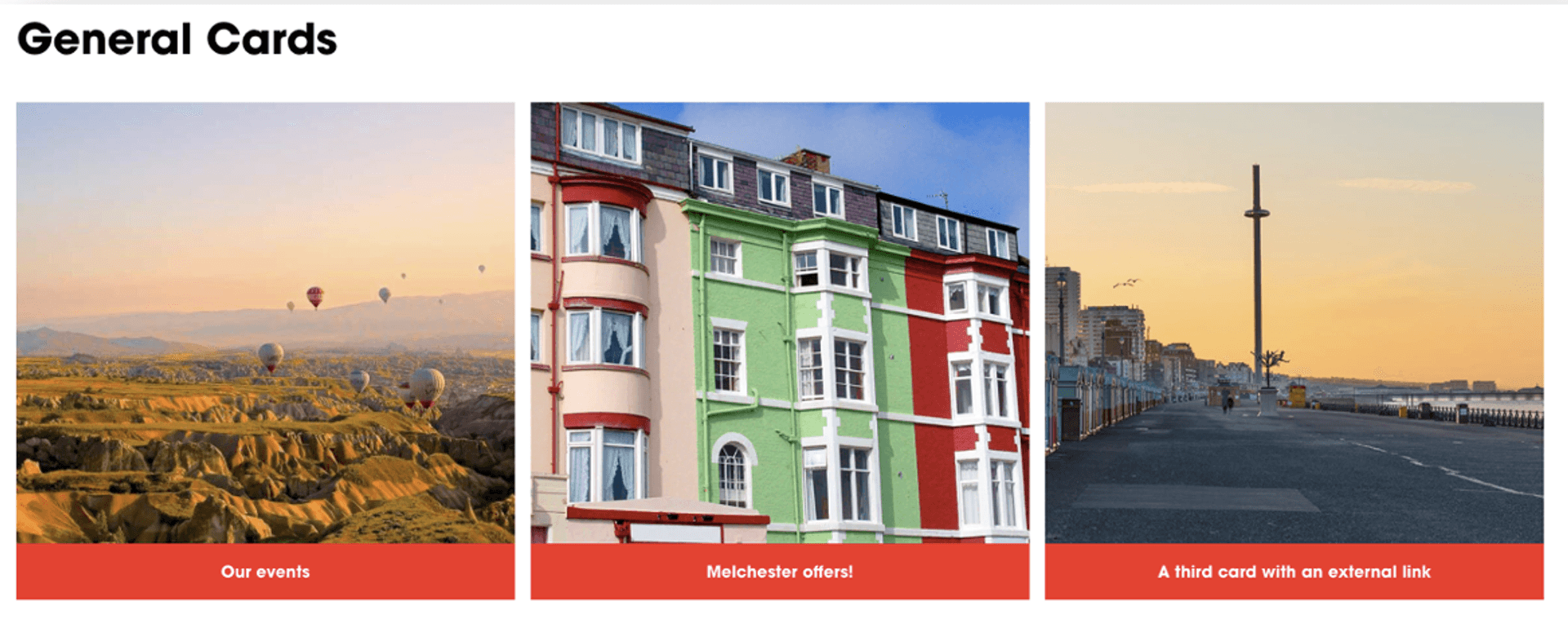
General Cards
To use the General Cards function, add the block and create individual cards by adding text, images, or links. Customise the layout, styling, and content as needed. It should function as a flexible, visually structured way to present information in distinct, easy-to-read sections.
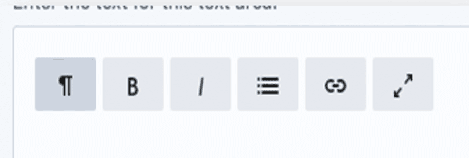
Text Box Features
To use the Text Box features, add the block and enter your content. Use formatting options like bold, italics, bullet points, and alignment to style the text as needed. It should function as a flexible content area for adding and structuring written information clearly within a page.
Button/Links
To use the Button/Link Options, add the block and choose between different styles such as text links, buttons, or call-to-action (CTA) elements. Customise the text, URL, and appearance, including size, colour, and alignment. It should function as a navigational or interactive element, guiding users to other pages, sections, or external resources.
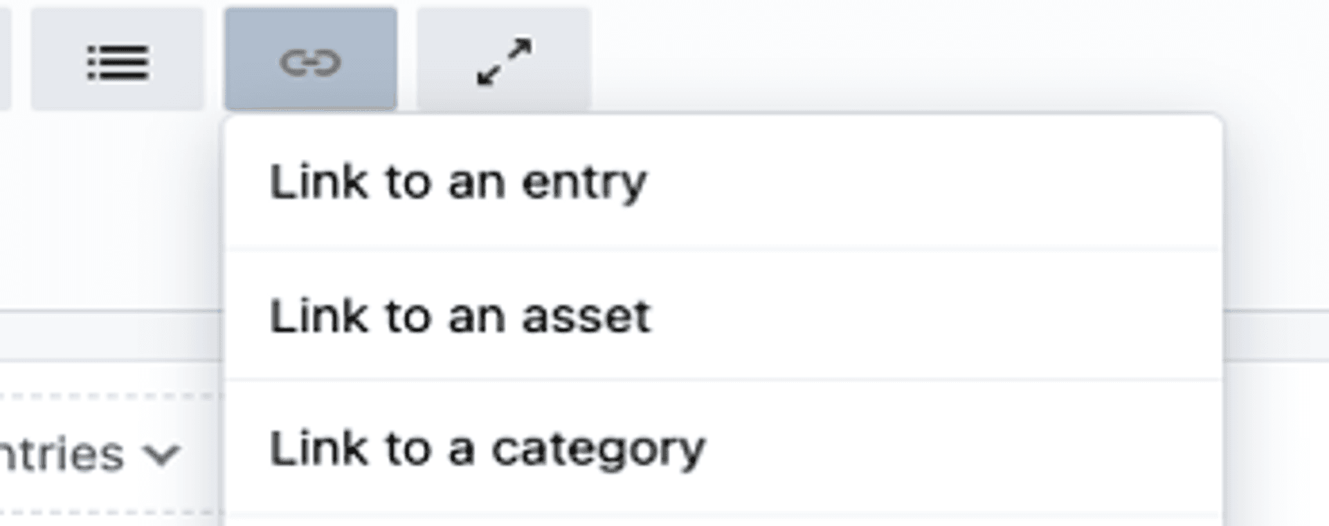
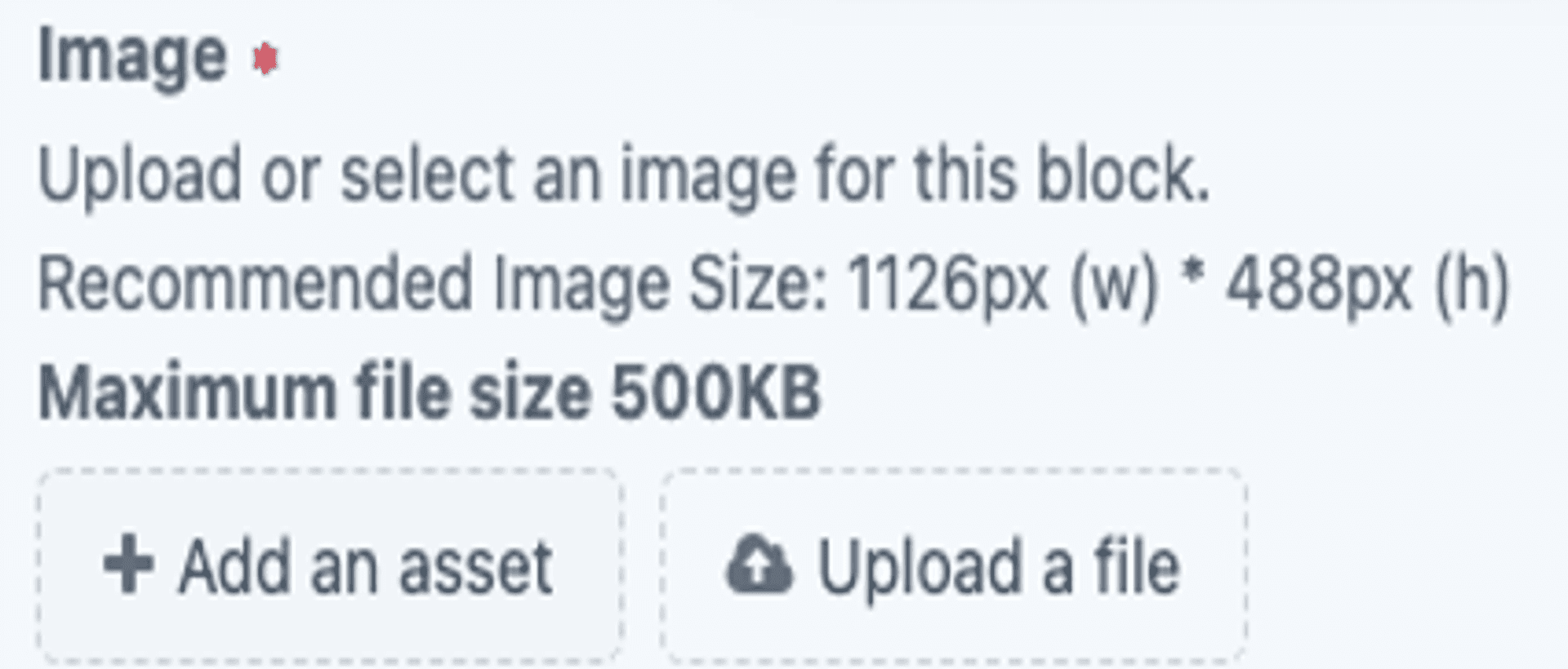
Image Dimensions
To use the Picture Dimensions feature, upload an image and ensure it meets the recommended size guidelines. Adjust cropping, scaling, or aspect ratio as needed to fit the design layout. It should function as a way to maintain visual consistency and optimise image display across different devices.
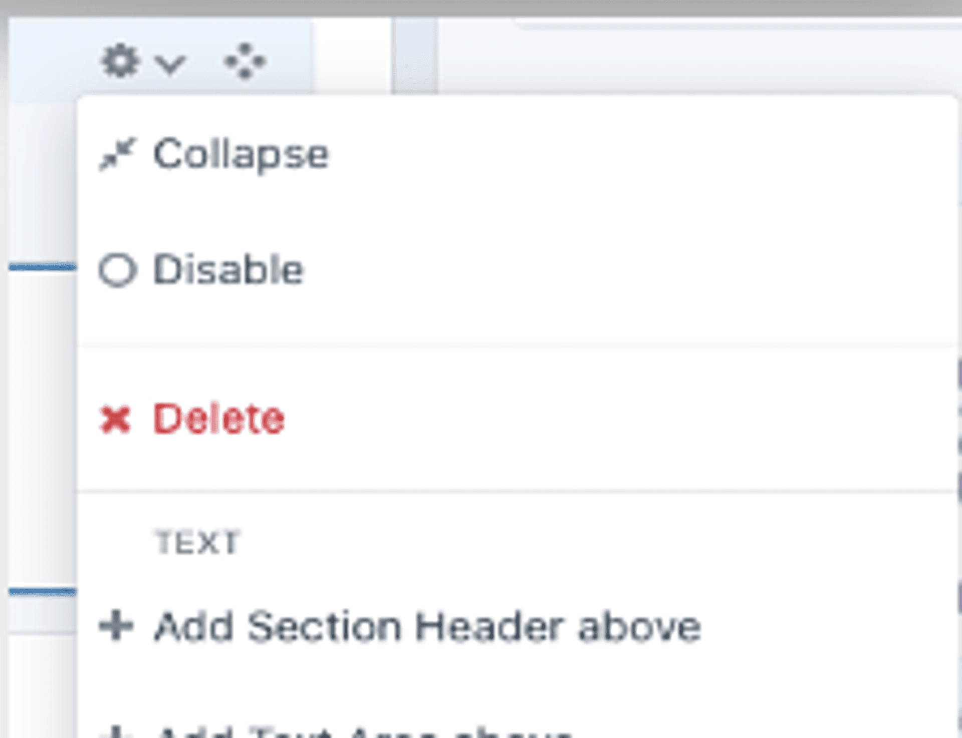
Drop-downs in Settings
To use the Drop-downs in Settings, select a dropdown menu and choose the appropriate option based on your content needs. These drop-downs control various settings, such as layout, visibility, styling, and functionality. They should function as quick selection tools, allowing you to customise how content appears and behaves within the page.
